Showing posts with label Canadian artists. Show all posts

Sunday, November 10, 2013

Painting subtlety


The opening of  Vestiges, Carol Bajen-Gahm's solo show , at Christina Parker Gallery on Friday night was special for me because I followed my friend as she wove her way toward  this stunning collection of work.

 Carol Bajen- Gahm and Margaret Ryall

 The title fits well with how I saw Carol develop this  work. My viewing at different stages,  sideways conversations and  discussion of  printmaking processes provided  just enough information to know what the work would be like, but not too much to spoil the surprise of seeing it massed together on the walls of the gallery. 

I see subtle changes in Carol's work as she spends more time in Newfoundland.  Nuances of place are creeping in and moving her work from its non representational beginnings to more abstracted  landscape references that are recognizable to those who know the area.  Torbay, a town on the edge of the Atlantic Ocean, and her house by the sea, provide vantage points for contemplation of people and the environment.  Observations during her walks in Torbay and forays to other communities are translated sometimes subtly and sometimes blatantly in this new work.

Her processes are changing too.   Oils are being integrated with encaustic and various printmaking processes to create subtle, layered works that invite close inspection.

In her words:

Ephemera Series  / collograph, encaustic on panel, 12" x 9", 2013


Seven Seas Shoreline Series /  monoprint, pigment stick, and encaustic on panel, 10.5" x 11", 2013

 " Vestiges and ephemera are all around us. We find them in old photographs, deteriorating buildings, or simply washed up momentarily on a beach. They evoke not only the thrill of discovery, but also the spirits of past generations. 

The artworks in this exhibition address the idea of impermanence. Many of the things we experience in our lives are either ephemeral, lasting only a short time or vestigial, in the process of disappearing. 


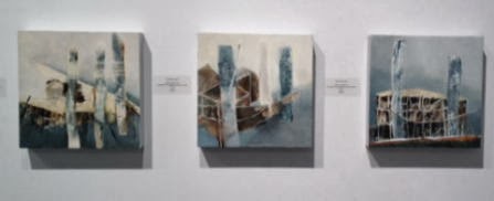
Torbay Codflake Series / oil, pigment stick, graphite and encaustic on panel, 12" x 12", 2013

Torbay Bight Series / oil, pigment stick and sand on panel, 24" x 18", 2013

  Vestiges, looks back to the salt cod flakes of Torbay Bight which are no longer in existence,


Cape Spear Battery Series / oil, pigment stick and encaustic on paper on panel, 35.5" x 29", 2013

 to the Cape Spear Battery slowly eroded by time, 

Riddle Fence Series oil, pigment stick and encaustic on panel, 12" x 12", 2013

and to learning to make a riddle fence, a vanishing art being kept alive at English Harbor, Trinity Bay. 

 The colour palette used to make the paintings for this exhibition celebrate and pay tribute to recently resurrected traditional Newfoundland paint colors."


Saturday, February 27, 2010

And the answers...

I am happy to report that I give full marks to both Don and Teresa for their astute viewing. Kathy is equally astute because she knows a keener when she sees one. As in any good assessment there has to be room for individual interpretation. #7 was the "room to maneuver question" and Teresa gave an excellent argument for her answer. Great job participants!

Hockey Organ by Graeme Patterson speaks on many levels and Teresa's commentary on the piece is extensive. She moved beyond my initial interactions with the work and caused me to return to the work and think about it again. I realized how little time I actually gave each piece and how superficial my interactions with the work actually was. There's no excuse for this except the hurried pace of live. How much do we miss using this excuse?

I heard Graeme Patterson speak about his work in St. John's last year when he was on a panel addressing the topic of Art in the Margins and he kept me attentive and wondering during the whole talk. Most of the time I couldn't get beyond "how does he come up with these ideas?" It is well worth looking at his website to broaden your context for the viewing of Hockey Organ.

Teresa says:
The Organ depends on a participant, now this one I find humorous, as in "hockey night in Canada" theme with the organ music thumped out. The initial viewing of the organ brought to mind a church organ which of course made me think about "what does the organ player think when playing. Then it got deeper. The organ as representing a religious belief plus a Canadian sport/business enterprise. The infiltration of Canada by religious orders to subdue the masses as a type of sport. Oh my mind really loves this one, on so many levels. It would be interesting to read others takes on these images.

I challenge you to look again at any one of these images and provide us with your response to it.

Wednesday, February 24, 2010

You, the viewer

I'm presenting Exhibition 5 of Screen 2010 by asking you to participate in a viewer's quiz. The theme is one we can all identify with- The Stuff of Us: Our Objects- Our Selves. Here is the link to the exhibition. Take a scan through the nine works to acquaint yourself and then see if you can match the question with an image. Which one....

1. uses a common household material to comment on the emptiness of consumerism?
2. shows the power of mass marketing?
3.makes a humorous and sinister comment on concealment?
4. is the best comment on global warming?
5. depends on the viewer as a participant?
6. comments on the ever increasing demand for fossil fuels?
7 . relies on scale and other art elements to make a point?

Answers and comments follow in the next post. If you must know the "correct" answer put your paper somewhere safe!

Saturday, February 20, 2010

Exhibition 4

Back to contemplating Canadian art and artists.... Screen 2010, Exhibition 4. The theme, If these walls could talk: Room for reflection is an interesting one in which" architectural spaces are metaphors for social realities". You will find a range of work from painting to sculpture to photography. All of the artists appear to be responding to the physical and connected social and psychological changes that occur as the urban landscape changes in various ways. Have a look at the eleven works here,

Many of these artists are new to me although one of them is a Newfoundlander whose work I've seen often and I've visited his studio. Christopher Pratt's Institution (# 6) is very representative of his subject matter and style. He is probably Newfoundland and Labrador's best known artist nationally and is one of the pioneers in the arts community here. His work is hard edged and sparse with the lack of details creating an almost fantasy land of precise lines and perfection. Check out his images on CyberMuse.


A new artist to me is Dina Gonzales Mascaro who lives in Vancouver by way of Argentina where she studied sculpture. I enjoyed both New Wall: Hospital + Parking Lot (#10) and Nice (#11) because they connect with subject matter I am interested in. Although the materials are recycled from different places/demolitions, there is a purity about the way she puts them together. The colour and textures are exquisite. I think it is difficult to create work that is both substantial and delicate at the same time but this artist has achieved that.

D. Bradley Muir's exploration of the tentacles of urban sprawl in his Dreams for Sale series is interesting. Velvet Room (#5) and Midnight Haze (#6) both struck a cord with me because this small city I live in seems to be expanding in leaps and bounds everywhere I look. Isn't it ironic that the real dream is being constantly bulldozed to make room for the other dreams.

I'd love to hear your impression of all or any of these works.

Monday, February 15, 2010

Exhibition 3

I'm on Exhibition 3 of Screen 2010 today. There will be fourteen Exhibitions in all with the last one being mounted in March. Over time, I plan to look at each exhibition and highlight one artist from each exhibition whose work appeals to me. It may take me a year to do that with other aspects of my own art popping up as well as responding to new inspirations.

The theme of Exhibition 3 is Competition: Winning Isn't Everything curated by Milena Placentile. Now here is a concept I can sink my teeth into. In the course of my education career I have seen the positive and negative attributes of competition and there has always been more negatives in the drive to be the best, to reach the top, etc. It usually means someone else suffers. I've always believed that as a society we should put more energy into encouraging/teaching how to cooperate, collaborate and develop partnerships. Working together is definitely more difficult than looking out for yourself and moving on up the line.

I was pleased to see Angela Grossmann's work in this exhibition. The general theme of her work is displacement and an examination of the social margins of life.

I first came across Grossmann's name in Canadian Art several years ago and I was immediately smitten with her work. Her backgrounds are often developed through a subtle application of collaged elements that support rather than detract from the finished work. She is also know for painting over images from previous work. The figure features prominently in all her work I've seen. Her figures are delicate and unfinished, hovering on the canvas with a tentativeness that always makes me think that with a few swift marks the whole scene could be changed to highlight something more positive , better or even more questioning. The drips and runs add to the tentative feelings I get. I see this tentativeness as the strength of her work and I'm sure it is not easy to create.

Her work in Exhibition 3 is titled Alpha Girls III which examines the adolescent's need to be accepted and socially popular. The grouping shows all the posturing, rivalry and falseness of this pursuit.

To see more of Angela Grossmann's work check out this link for the Dianne Farris Gallery.

Did you have a favourite in Exhibition 3?

Sunday, February 14, 2010

Exhibition 2

The theme of Exhibition 2 of Screen 2010, created to celebrate the visual art of Canada is The Art of Knowledge- When Seeing is a Way of Knowing, curated by Donna Wawzonek. The exhibition centers around the work of Alex Janvier featured in the first slide. Other artists whose work embodies the qualities of Janvier's paintings were chosen to complete the exhibition . From my perspective it is an an odd assortment of work. Given the title I had preconceived notions about the type of work and the artists who might be included (given my limited knowledge). The work goes off in many different directions.

I found Pam Hall's On the Physiology of Female Reciprocity interesting for its title and concept . It explores the many ways a female body receives and gives. This diptych is part of a larger work titled Fragments from a ReConstructed Gynaeopedia which examines the female body as a site of knowledge. See other works from this series here.

It doesn't hurt that I know the range of Pam's work and where this particular piece fits in her long career. She is active in the arts community in St. John's, but much of her work has been show outside the province. To get a sense of the interesting work she has created check out her website.

I am particularly attracted to her Small Gestures, a daily practice she began in 2009
" to remind herself to be attentive , awake, and mindful as she begins each day. Simple, humble and ephemeral- these performed gestures are photographed and shared daily with friends on Facebook. They have evolved into a series of gentle interventions which serve as small "presents" of "presence". "

Did you have a favourite in Exhibition 2?

Exhibition 1

Now that the Olympics are in full swing I thought my readers should know there are cultural elements to the games. There is a great site called Screen 2010 that has ongoing online exhibitions by Canadian visual artists. It's a great way to get an overview of artists' work across Canada.

Over the remaining days of the Olympics, I would like to encourage you to participate in a viewing and discussion of the exhibitions at Screen 2010 starting with Exhibition 1 (scroll down to the bottom) Groups bring us together, Groups place us apart, curated by Kate Armstrong. When you launch the exhibition, along the top are buttons for About the exhibition, About the artwork and About the artist. I found the viewing much more meaningful when I used this information.

I'll begin.

Exhibition 1 was easy for my because one of the artists is a favourite of mine - Aganetha Dyck who created The Masked Ball. Dyck is interested in the power of the small and inter species communication. She poses the question... what would happen if honeybees disappeared? Much of her recent work is created by placing objects in beehives and leaving them there for a period of time. It is a kind of collaborative art without the conscious agreement of the bees who are just doing what they do best.

Check out this article in Canadian Art for additional information about her process and a picture of the bees doing their thing. The work referenced here is at The Michael Gibson Gallery. Of course Dyck's work plays nicely against Michael Snow's, Bees Behaving on Blue.

Where do your interests lie in Exhibition 1?

Monday, January 11, 2010

Reading layers

In response to the last post Kathy noted that:
art primarily deals with "spaces in between." That is, we all observe what's around us and use it to inform our art, but we have to find connections that aren't obvious in order to make our work meaningful. Those "connections" occur somewhere between the realm of reality and our imaginations. Those are what I would call the "spaces in between." there is a space between our original perception of reality and how we represent this in our work.

It seems there are many" in between" spaces in art. A common one is the use of layers to build up a painting. There is also the use of negative space as a compositional device. Tanja Softic uses both in her work.


Morning over there (2008) 15 x 36 in. acrylic, graphite, chalk on paper mounted on board

Last year I was excited to find the work of Tanja Softic as I was researching various artists who cite memory as a driving force in their work. Since that time I've visited her website several times and each time I come away with new insights into her work.

Tanja is an associate professor of art at The University of Richmond, but she was raised in Sarajevo, Yugoslavia. While she was earning her MFA in the United States, war broke out in her homeland permanently changing the pattern of her life.

In her words:

My work addresses factors of cultural hybridity that shape the identity and world view of an immigrant: exile, longing, translation, and memory.

.....The visual vocabulary of my drawings and prints suggests a displaced existence: fragmented memories, adaptation, revival, and transformation. Because I do not live and work within the comfort or boundaries of the culture in which I first learned to observe, interpret and engage the world, I have the arguable privilege of having lived more than one life. My memory is my virtual self and, paradoxically, my most authentic self.

Her references to memory as a "process that involves erosions and accretions" strikes a cord with me as I construct my paintings for Reading a Garden 18 months after my two week stay in Birr Castle Demesne. I am amazed at how quickly I forget specific details and how easily I embellish others and believe them to be true. Softic sums it up well.

" Re-membering becomes an act of reconstruction, where one works with what is there and tries to visualize what has been lost.

The images in Softic's more recent works suggest what Said called "an awareness of simultaneous dimensions." The maps and star charts represent conventional interpretations of distance and scale. Softic says:

I am interested in what they may become, layered upon each other, in visual conversations with other elements in the drawing. In Migrant Universe, the drawings function as re-arrangeable continuum of maps, landscapes and portraits of memory and identity.

The map of what happened below is part of the Mirgrant Universe series.

Add ImageThe map of what happened (2008) acrylic, chalk, graphite on paper on board 60 x 120

Nomad's polyphony (2004) 42 x 108 in. acrylic, charcoal, chalk on handmade paper

While I have found several different bodies ofSoftic's work and critical discussion of it, I was first attracted to the pods, orchid blooms and shells mixed with body organs and bones all juxtaposed with geometric shapes and architectural details.

Allegory of time (2000) 58 x 52 in. acrylic, charcoal, chalk on paper

The layers are complex but negative space exists within and top of the surface which has the ability to both calm and command the viewer. Her work has a dreamlike quality that provides a sense of past and present displayed together. Drawing and printmaking allow her to build up layers of subtle colour and texture. I like the way some of the objects recur in varying combinations throughout different works. David Bickman 2003 noted that "She combines the skill of a medical or botanical illustrator with the soul of a poet to make extremely detailed drawings that are nothing if not evocative."

Porous histories (2005) 15 x 48 in. etching and mezzotint

Perhaps you would like to look at the work of my friend, Catherine Beaudette, who has a summer home in Duntara near where we live. Catherine teaches at Ontario College of of Art and Design. Look at her Recent Works and read her artist statement. You will see why.

Saturday, January 9, 2010

The spaces in between

Many people are attracted to the skeletal structure of trees. Trunks and branches have a strong presence that demand attention. But for me the real action happens in the spaces between the branches where the intricate play of leaves produce delicate patterns.
Messenger, 2009, mixed media on board

Messenger is a mixed media painting from my Reading a Garden series. The sun shining through the vines that sheltered this statue in the Millennium Garden reminded me of stained glass. My mind wandered to consider what would happen to this scene over time. Voila! a painting is created.

There are many landscape painters who have interesting ways of rendering "the space in between". Two of my favourites are Canadian artists Jennifer Woodburn and Mandy Budan.

Spring Light (2009) 11 x 14, acrylic, Jennifer Woodburn

Jennifer Woodburn grew up in Saskatchewan and now lives in Ontario. She is primarily a self-taught artist, who has relied on occasional workshops and classes for her education. Working usually in acrylics, emphasizing line, shape and colour Jennifer creates simpler forms from what she sees in the landscape.

Jennifer says:
Mine is a graphic take on life. Through the relative chaos, I find the design in nature and organize it on canvas. Using line and simplifying what I see, I look for interesting shapes and colours, and explore the spaces in between. Rhythm is found, and exaggerated. With an upbeat palette and a bit of whimsy for good measure, I capture Southern Ontario landscapes and rural architecture in acrylic paint on canvas.


I am attracted to Jennifer's work for its lively colour combinations and the rhythm she instills through her use of line and colour. This less is more approach helps the viewer to see the strong rhythms and patterns in nature. Her ability to synthesize the landscape makes me realize how much detail I could delete from my work. Jennifer has many more works on her blog and website.

Fall Again (2009) 12 x 12, acrylic on canvas, Jennifer Woodburn


Mandy Budan paints abstracts of the landscape. She emphasizes and rearranges elements in very unexpected ways. Her colours are strong and she relies on repetition of colour and shapes to create intricate patterns. One of the most amazing aspects of her work is that when you look at it up close it appears to be random, colourful shapes but when you see it at a distance it looks very realistic. How do all those little bits and pieces of bits create realism?

Summer Morning (2008) 24 x 30, acrylic on panel, Mandy Budan

Spring Light (2008) 11 x 14, acrylic on panel, Mandy Budan

I find it quite amazing that Mandy can break each painting down into such patterned parts and then create a realistic painting in the end. Her colour usage is so vibrant and often unexpected when you take a close look. While I've chosen two paintings featuring trees, Mandy paints different aspects of the landscape.

Also check out the paintings of Alison Dunhill, a British artist, who uses colour and fluidity of expression to convey the emotional impact of the landscape. There is a balance in focus between the more obvious structure of trees and the spaces in between in her tree paintings.

Are there other "spaces in between" that have been explored through art?